Official Cora Retail ERP logos and the rules for using them — for video editors, designers, press and partners. Cora Retail follows the Techcora brand; this page is everything you need to design with it, including how to cut a video.
ZIP, 3 MB — logos in all four colour versions, plus dark and light video plates and end cards.
The mark is a price tag drawn in the Techcora dot matrix — dots heating from ember red to gold toward the eyelet, the “core” of the parent brand. Full colour on black is the primary logo.
Primary logo. Use on black or very dark backgrounds wherever possible — this is the end-card logo.
On white or light backgrounds. Keeps the ember tag with a black wordmark.
On dark backgrounds when colour isn’t suitable: grayscale, small corner bugs, merch.
On light backgrounds when colour isn’t an option: documents, stamps, print.
Transparent PNGs, trimmed to the artwork. Never upscale past the file’s own size — for 4K or large print, ask us for the master artwork at info@techcoracorp.com.
Keep clear space around the logo equal to the height of the “C” in CORA. No text, graphics or edges of the frame may enter this zone — in any version, size or medium.
Below these sizes the dot pattern breaks down.
For very small uses — favicons, a corner bug in a video, embroidery — use the high-contrast tag mark on its own, without the wordmark.
“CORA / RETAIL” is drawn, not typed. Always use the supplied files; never retype it in Toreks or any other font, never split CORA from RETAIL, and never use the wordmark without the tag except in plain running text, where the name is simply written “Cora Retail ERP”.
Use the files as supplied. Don’t redraw, rearrange or alter the logo in any way.
Burning Orange is the Techcora signature, taken from the molten core of the Earth. Use it as an accent — a keyword, an underline, a call to action — and let black, dark grey and white carry the rest. It is never a full-frame fill.
The tag’s dots run from ember red through Burning Orange to gold. Use this ramp only in the logo itself and in brand glows or transitions — never for text, UI or charts. Pale gold disappears on white, so on light backgrounds stop the ramp at Amber.
A futuristic, geometric display face for headings, titles and large text only — never for sentences or captions. Toreks is a licensed font, so we can’t distribute it; obtain a licence from the foundry, or ask us for rendered title cards.
A modern sans-serif for everything else — body text, captions, lower thirds, subtitles and end-card copy. Light to Extrabold.
Get it free on Google Fonts →The look: clean black or white grounds, a single Burning Orange accent, real stores and real product screens, calm and precise motion. It should feel engineered — confident, never loud.
Pick one per video and stay in it — don’t flip between dark and light scenes.
| Ratio | Size | Use for | Title-safe area |
|---|---|---|---|
| 16:9 | 1920 × 1080 | YouTube, website, demos, presentations | 5% margin on every side (96 px / 54 px) |
| 9:16 | 1080 × 1920 | Reels, Shorts, Stories, WhatsApp Status | Keep text out of the top 270 px, bottom 670 px and 65 px each side |
| 4:5 | 1080 × 1350 | Instagram & Facebook feed ads | 5% margin on every side |
| 1:1 | 1080 × 1080 | Feed posts, WhatsApp | 5% margin on every side |
Cut the 16:9 master and the 9:16 version for every campaign; 4:5 and 1:1 only when asked. Frame the 9:16 cut on its own — don’t just crop the 16:9 edit.
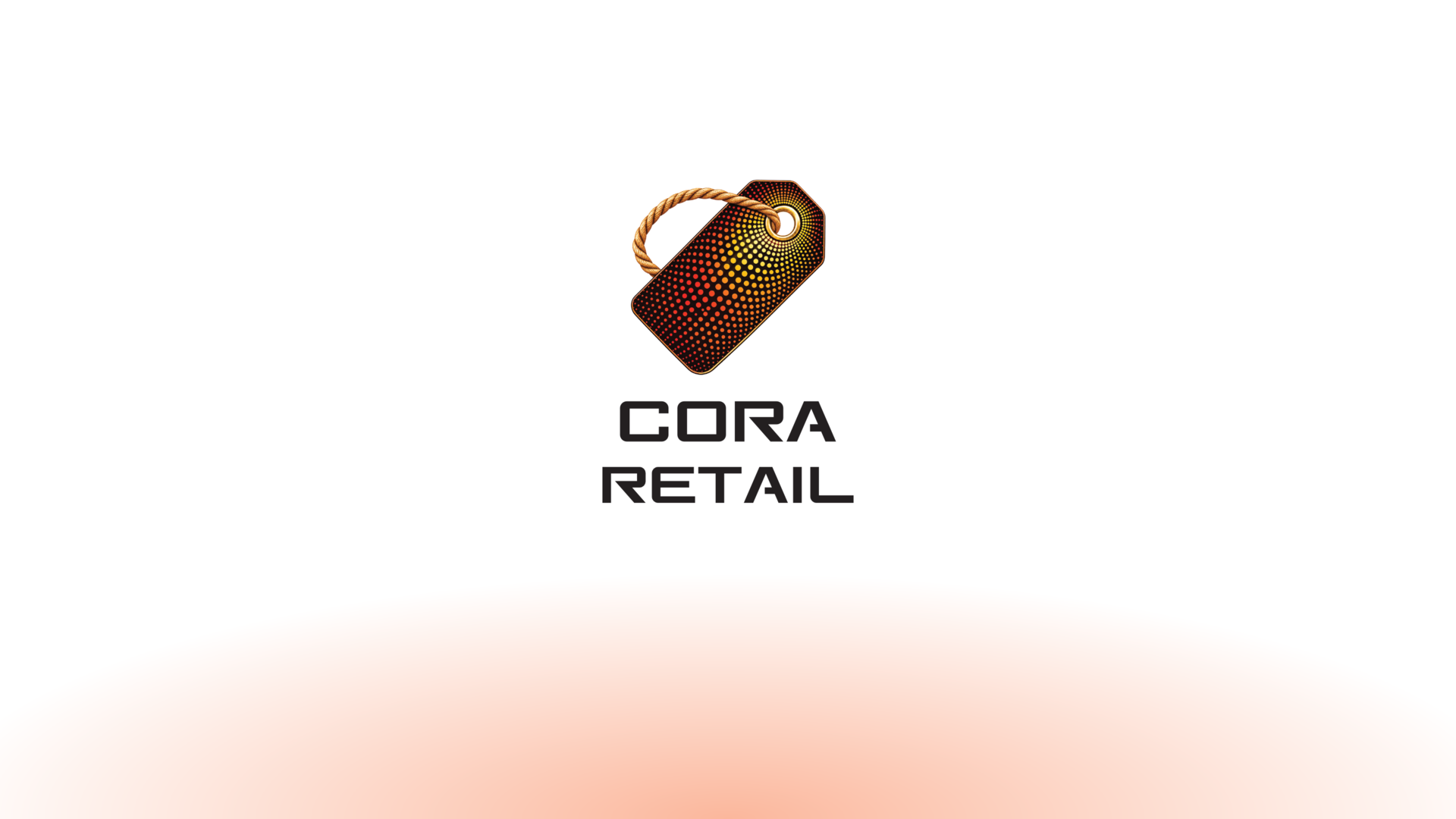
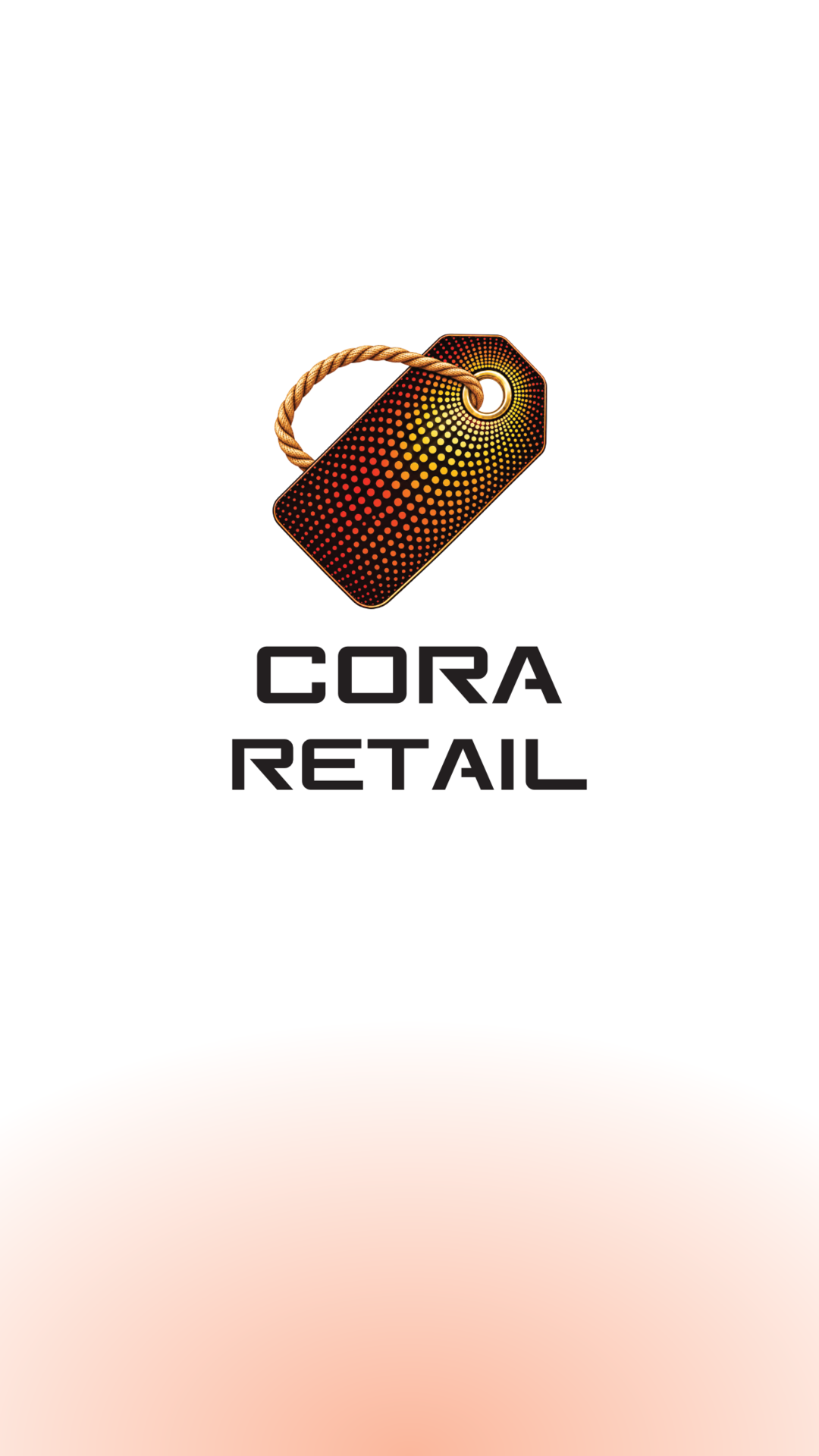
Full-colour stacked logo on the dark plate, or the light-background logo on the light plate. The tag at least 200 px wide at 1080p, clear space respected, nothing else within it.
16:9 only: high-contrast tag mark — white on dark footage, black on light — 72 px tall, 48 px from the top-right edges, full opacity. Never on 9:16 — the platform UI already crowds it.
Only over a calm, dark area of the shot, or on a Dark Grey bar. If the footage is busy, cut to black for the logo instead.
| Element | Typeface | Spec |
|---|---|---|
| Title card | Toreks | 72–110 px, white, max 5 words |
| Lower third — name | Funnel Sans Semibold | 44–52 px on a Dark Grey bar |
| Lower third — role | Funnel Sans Regular | 32–36 px, 70% white |
| Captions (9:16) | Funnel Sans Semibold | 48–56 px, max 2 lines × 32 characters |
| Captions (16:9) | Funnel Sans Semibold | 40–44 px, max 2 lines × 42 characters |
| End-card CTA | Funnel Sans Semibold | 48–60 px, white; URL in Burning Orange |
Book a free demo
retail.coraerp.in
WhatsApp +91 82484 95913
Book a free demo
retail.coraerp.in
WhatsApp +91 82484 95913
Cora Retail ERP on first mention, Cora Retail after that. Made by Techcora.
Not: CORA · CoraRetail · Kora · Cora ERP Retail · Cora app
“The AI-native retail ERP for India.”
Don’t invent numbers or superlatives (“No. 1”, “fastest”, “free”), and don’t name customers or their figures without our written approval.
Use this when you need a short description — in a video description, a press note or a partner page.
Cora Retail ERP is the AI-native retail ERP for Indian grocery, supermarkets and quick commerce. It gives a store its own branded shopping app, a counter POS with GST invoices and khata, a back office for inventory, purchasing and delivery — all on one platform with one source of truth for stock and money, at 0% commission. Cora Retail ERP is built by Techcora Corporation.
For co-branding, sponsorship or anything these guidelines don’t cover, write to us before you publish. Using the logo doesn’t imply a partnership with or endorsement by Techcora.
info@techcoracorp.com